We are kicking off the new year with nothing but a bang and introducing ourselves with a completely new and redesigned corporate identity. An elevated approach that pays homage to our visual heritage, but simultaneously puts a bright spotlight on our company’s appearance. An identity that truly represents the professional performance we are delivering on a daily base.
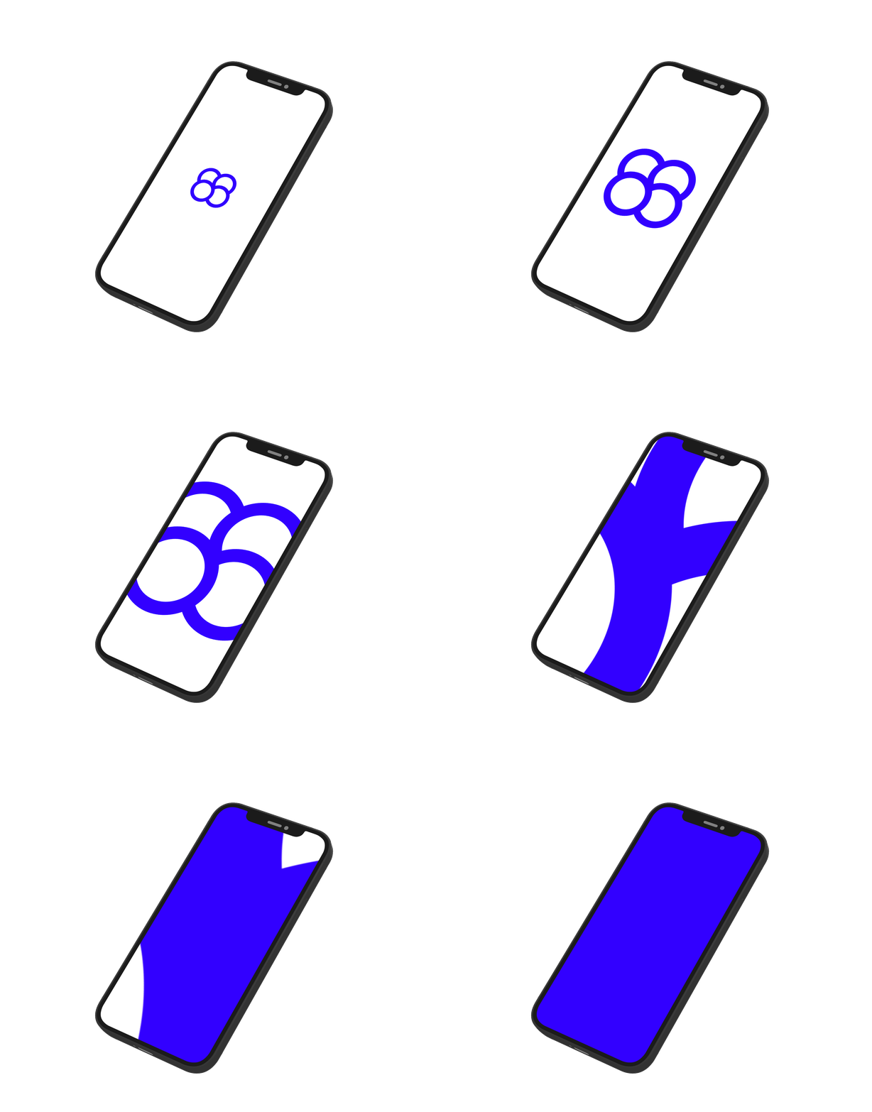
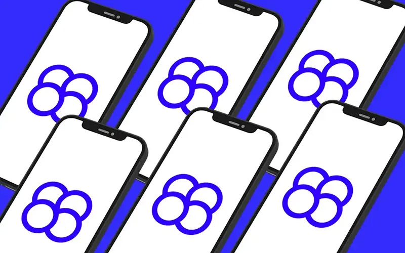
Mosaic is the perfect description for what we do: Combining many multiple and diverse character, talents or tasks to create one floating unit and make it flow smoothly like a Swiss clockwork. This core idea is represented through our new logo: Each circle itself is already in eternal motion — but on top of that they intertwine, connect and engage with each other to form a vibrant and powerful synergy. This organic fusion is something that we are experiencing and valuing every day.
A floating unit —
The perfect embodiment of our aspiration
The rest of the logo is topped off with a modern, but yet very classic Futura typeface. Its main characteristics are a bold and solid appearance, as well as customized letters (experts will obviously notice, especially when looking at the »i« letter). Mosaic’s new logo and corporate identity has been created completely in-house. The concept and design was executed by our marketing and visual art director Philipp Schäfer.
